
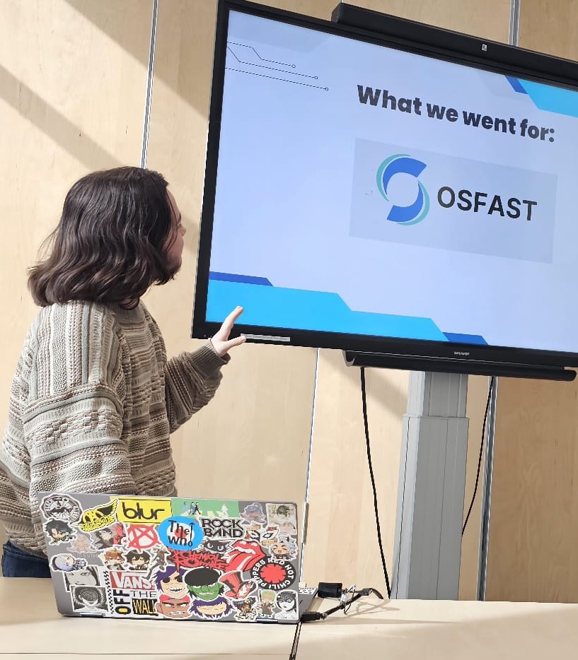
For the first group project of this semester, I worked for the client Oscar in creating a cohesive brand identity for his small IT consultancy business, OSFAST. The client’s needs were to have a brand guide that reflected his friendly personality, as well as maintaining professionalism needed to appear trustworthy to his clients.
In the beginning of the project, each member in the team explored different ideas by creating individual stylescapes. For me, I listened to the client’s desire to have an approachable demeanor, and his appreciation of hand-drawn elements to create something warm and friendly. Two requests he had were to focus on accessible fonts, and, if possible, incorporate blue into the design. Things that stood out in mine were a quick portrait of Oscar, the warm color palette with blue accents and the font chosen specifically to be easy to read for those with dyslexia. This stylescape ultimately wasn’t chosen by the client, as his focus was more for professionalism, and mine strayed too friendly to the point of being casual.
During the logo creation phase, I brainstormed various ideas for OSFAST, however, in the end, most of my ideas were incredibly similar variants, and not as broad as brainstorming should be. I homed in on one idea, putting my eggs in one basket, and in the end, my logo was not chosen either.
Following the feedback session with the client, indicating that Oscar wanted a more professional aesthetic, I and my group mate Tina co-created the final OSFAST Brand guide, taking inspiration from guides with similar branding style as well as inspired by the client’s personal hobbies as research to create a personal, yet sleek and professional design more aligned to the client’s wishes.